Transforming design-to-code with MCP
Artificial Intelligence
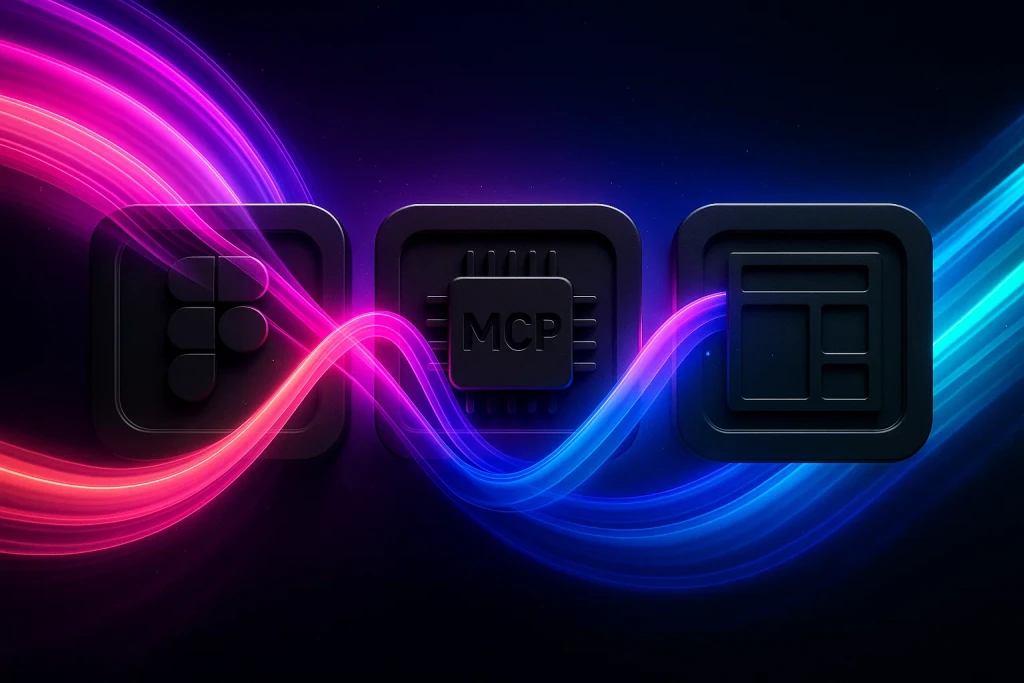
MCP Server
Workflows
When I joined Quartex, one of the first problems I noticed was the constant back-and-forth between designers and engineers. We’d mock up a new reporting widget in Figma, then spend days debating token names and CSS assignments. By the time code landed, it often looked nothing like the original vision. I knew there had to be a better way.
The Transaction Costs of Traditional Handoffs
- Translation Toll: Designers describe component intent in docs, tokens, annotations, comments; developers decode it.
- Rework Tax: Misaligned spacing, naming conventions, and style mismatches force multiple review cycles.
- Visibility Deficit: Once visuals leave Figma, designers sometimes loose sight of what ships, and engineers lack design context.
Multiple Stacks: Various teams are working with diverse stacks, compounded by inorganic growth (M&A) often seen in enterprise. Achieving a homogenised architecture and design is expensive, and often slow to progress at pace.
Introducing MCP as a bridge
When I discovered Figma’s Community-contributed MCP server. In my first experiment I dropped our dashboard file into the tool and watched it spit out Redux-ready React components, complete with semantic class names and tidy CSS variables. It felt like magic—almost a sci-fi moment where design and code shared the same language.
In our pilot, MCP achieved unprecidented fidelity to our visual designs. Suddenly we weren’t guessing at margins or style names. The tooling generated everything we needed, what arrived in the codebase was: Clean, Readable Markup, Correct Component Structure & Behaviour, Styling Aligned with Our Token Library, this enabled engineers could focus on logic and performance instead of manual translation. That one change reclaimed nearly 30 hours of sprint time in our first week.
Design System's done right are a Currency
MCP only works if you give it clear rules. We took a hard look at our design system and tightened it up. Every colour, every spacing token and every button variant now has a single, unambiguous nomenclature. Component variants live in predictable pages. We even added a simple JSON schema so the MCP server never has to guess which style to apply.
- Semantic Tokens in our design system ensured styling consistency
- Well-Named Component Variants removed interpretation ambiguity
- Modular Architecture lets AI assistants snap parts together predictably
Ideating to production level quality with Natural Language
From Hand-Off to Harmony
This new workflow changes how our teams collaborate. Engineers can focus on architecture and integration. Designers can double down on interaction patterns and micro-animations. Product leads can validate features with real business metrics instead of vague requirements. MCP becomes our shared ledger of intent and outcome.
In practice that means our weekly demos now include both a visual snapshot and a small ROI snapshot of how much time we saved, or what revenue uplift we expect from a particular feature. Design is no longer a cost centre; it’s part of our growth story.
Looking Ahead, What's Next?
We're close to a reality where an individual can viably spin up a shared design-to-code pipeline as easily as they install a dependency. That’s the future I see, where the only limit on innovation is our imagination, not the overhead of handoff.
Final Thoughts
Explore more


Let’s Build Tomorrow’s Products
Foster strategic collaboration to design AI-native systems that amplify human capabilities and experience