Featured Project
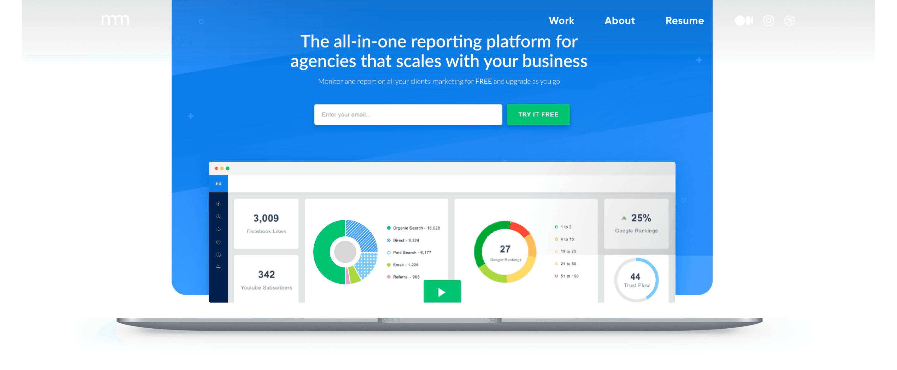
Hiilight's Agency Analytics Platform
Building an Agency Reporting Dashboard That Clients Actually Understand

1. Situation
Summary: The Big Picture
Core Result: Achieved a 3× faster agency reporting workflow by streamlining data views and workflows.
Hillights is an agency analytics reporting platform that aggregates marketing metrics across diverse services and outputs easy to understand reports at the press of a button. With current data toolsets, the data visualisation for marketing efforts is either non-existent, limited, or unspecific to marketing efforts. Hillights aims to fix that by bridging the gap between integrated data and easily communicating the results of marketing efforts.
My Role
Role: Lead UX Designer | Team: 3 Designers, 5 Engineers, 1 PM | Tools: Figma, Miro | Duration: 6 Weeks | Platform: Web SaaS
The Challenge
Agencies lost countless hours navigating disjointed dashboards and compliance data. Users struggled to extract insights quickly, leading to missed deadlines and frustration. Stakeholder feedback highlighted the urgent need for clarity, speed, and confidence in reporting.
Create easy to understand data visualisation that enables agencies to clearly communicate project efforts to their client.
Increase ease and efficiency of report generation
Modernise Ul and architecture for restructured Saas
2. Approach
Kickoff
When COVID-19 first hit many of our clients began to cut costs, to no surprise external services such as marketing are amongst the first to go. This left us with the time on our hands to start refining our business process. One of the topics discussed in large at the time was improving proprietary software, a metrics aggregator used to assist in generating analytics reports for clients.
Starting off, I was tasked with answering a few initial questions. Who is our primary user? What kind of goal do they have? Why would someone want to use this application? Is it worth investing in or switching to an established platform? How large of a scope are we willing to invest?
After a few initial meetings and exploration into alternative options, we determined both a need and an opportunity existed which would officially kick-off the start to Hiilights.
My Approach
• Mapped user journeys to clarify pain points and edge cases.
• Rapid wireframing and validation with real users.
• Collaborated closely with engineering on data pipelines.
Research Highlights: Agencies prioritised speed, intuitive filtering, and trust in audit data.
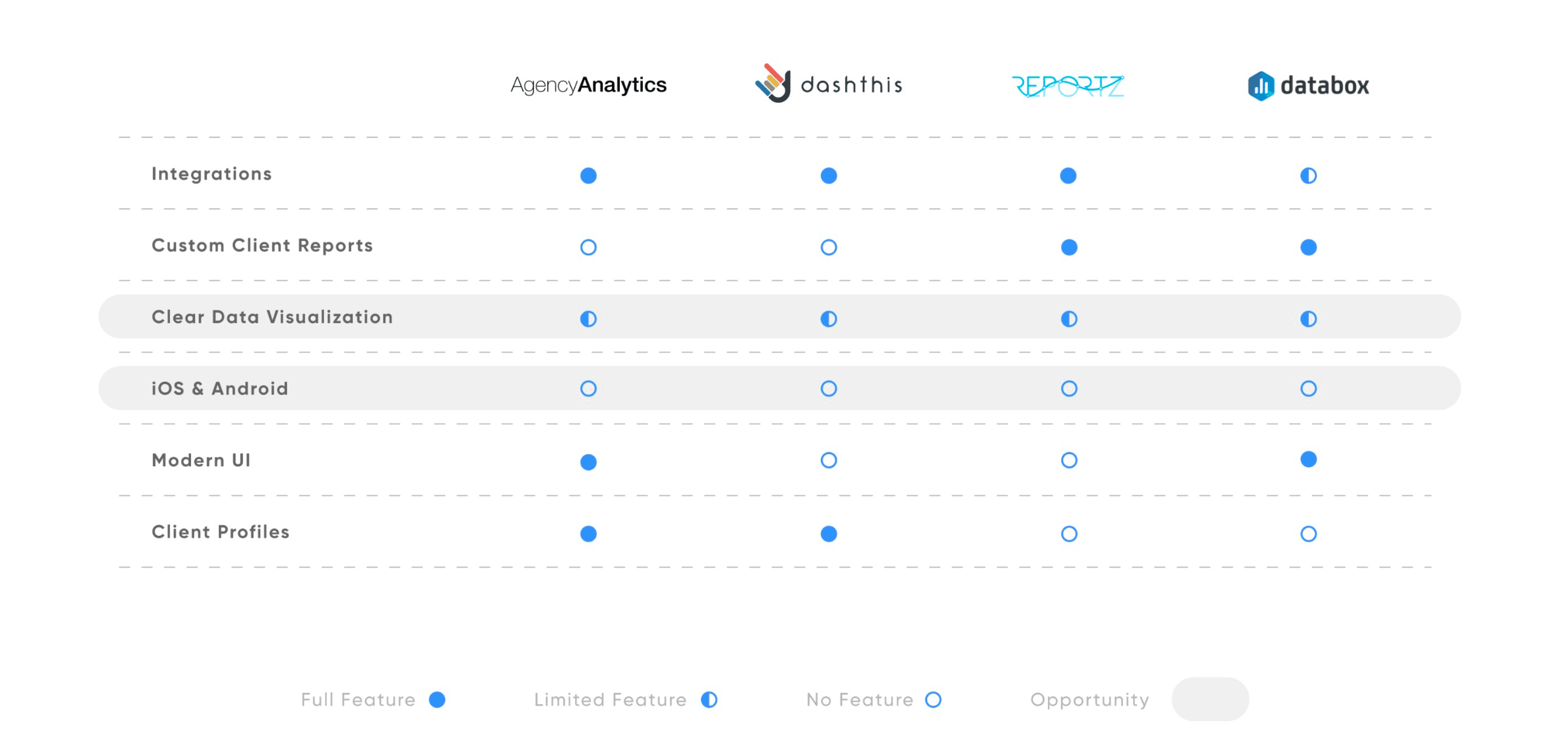
Competitive Analysis
In order to construct a concise and solid foundation for Hillights, had to explore the current market landscape and see what prominent agency reporting platforms were doing and where user goals are not being reached. I evaluated several features deemed vital from user surveys and stakeholder requirements to better identify
Competitive opportunities.
I found that only two of the four main competitors offered user client level profiles. All competitors offer feature limited or generalised data visualisation but all failed to communicate to users how their data should be interpreted and utilised. Only two allowed the user to export customised reports for clients. None of the platforms had a mobile application but all were responsive with suboptimal mobile experiences.
Evaluating Market Trends
Just how popular is small agency reporting? Is this a viable market or an oversaturated space? According to Google Trends, Search queries demonstrated no keyword trends over in the past 5 years with substantial overshadowing of feature offerings by larger holistic CRM services.
With this in mind, it became clear that nomenclature of features doesn't accurately represent customers search, where CRM's will have grown to over US$1.5bil by Q1 2021.
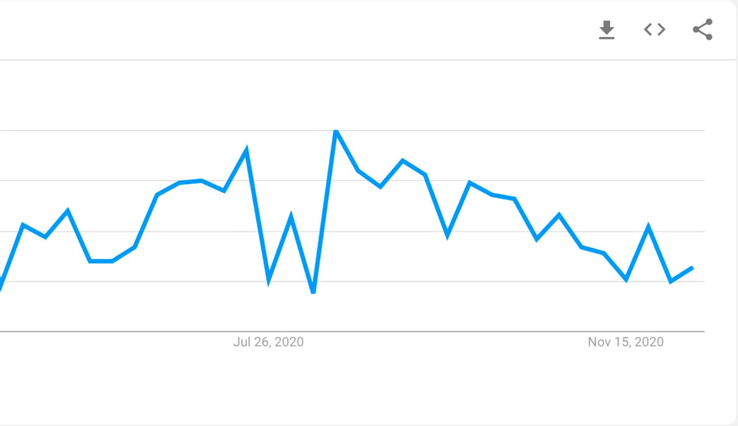
Source: Google Trends, Oct 2020
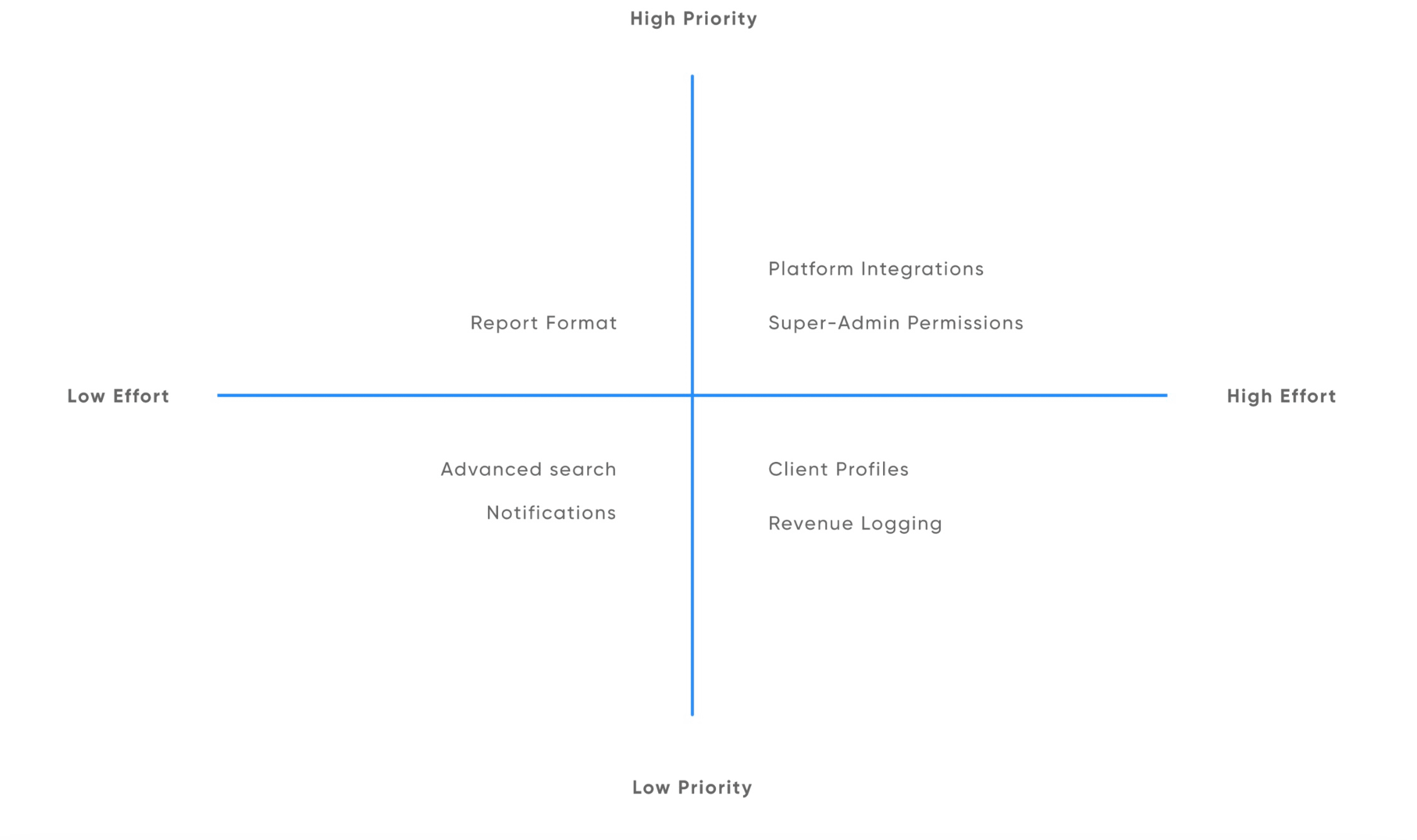
Prioritisation Plotting
Plotting a list of possible features onto a graph helped narrow down critical from nice to have features. This allowed us to develop the MVP that could be built upon in the future. A critical feature is the ability to oversee multiple agency level accounts. We can achieve this goal by creating what is essentially a super-administrator role, allowing for the management across a multitude of agencies.
Agency Owner
Chris is a small marketing agency owner looking to optimise client data to better demonstrate the impact his company makes for their clients. He's looking to optimise operations to maximise profitability but he's having a hard time finding an application that let him easily do this. CRM's look capable but are also overwhelming and expensive to implement.
Chris notices some of their clients become commitment-phobic and unrealistically pushy, while others just drift away and ignore most of the agency's insights and advice. He's looking to regain the position of expert in their minds.
Account Manager
Michelle is a full time account manager, she manages a numerous amount of client accounts and communication. She enjoys meeting with clients but is often overwhelmed by select questions regarding results and impact of marketing efforts. The metrics she presents are often satisfactory but for some clients they just aren't cutting it. She's looking for a quick and easy summary that she can present to the client in an easy to understand format that shows the impacted made towards a specific goal.
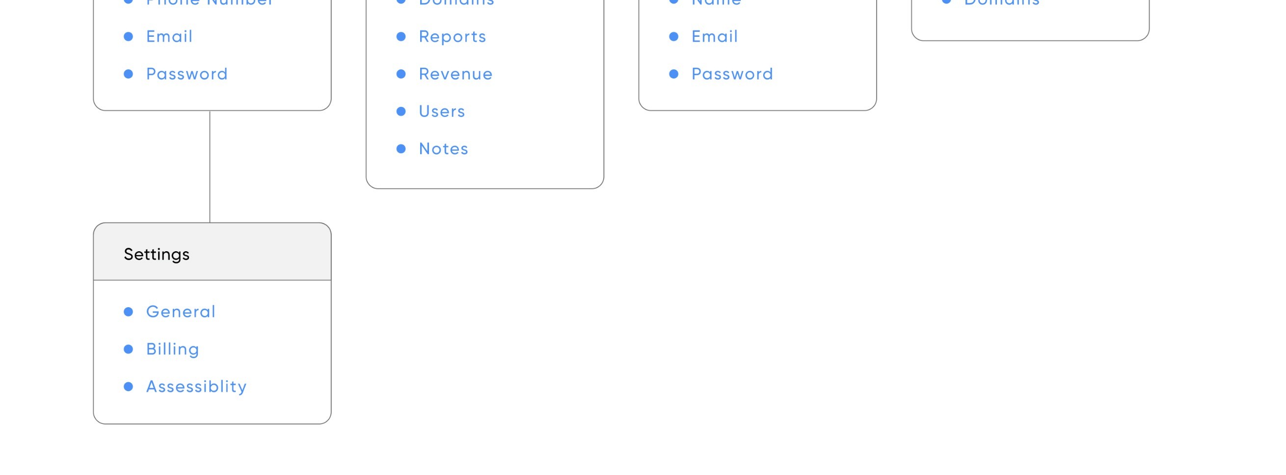
Information Architecture
Good information architecture creates clear paths for visitors, makes a site easier to navigate, and enhances the user experience. In term of a general redesign, the hardest part is explaining what aspects are more important than others.
I conducted card sorts with 3 account managers (A representation of the role who would be using the platform) to challenge my initial assumptions, implementing generally more accepted structure.
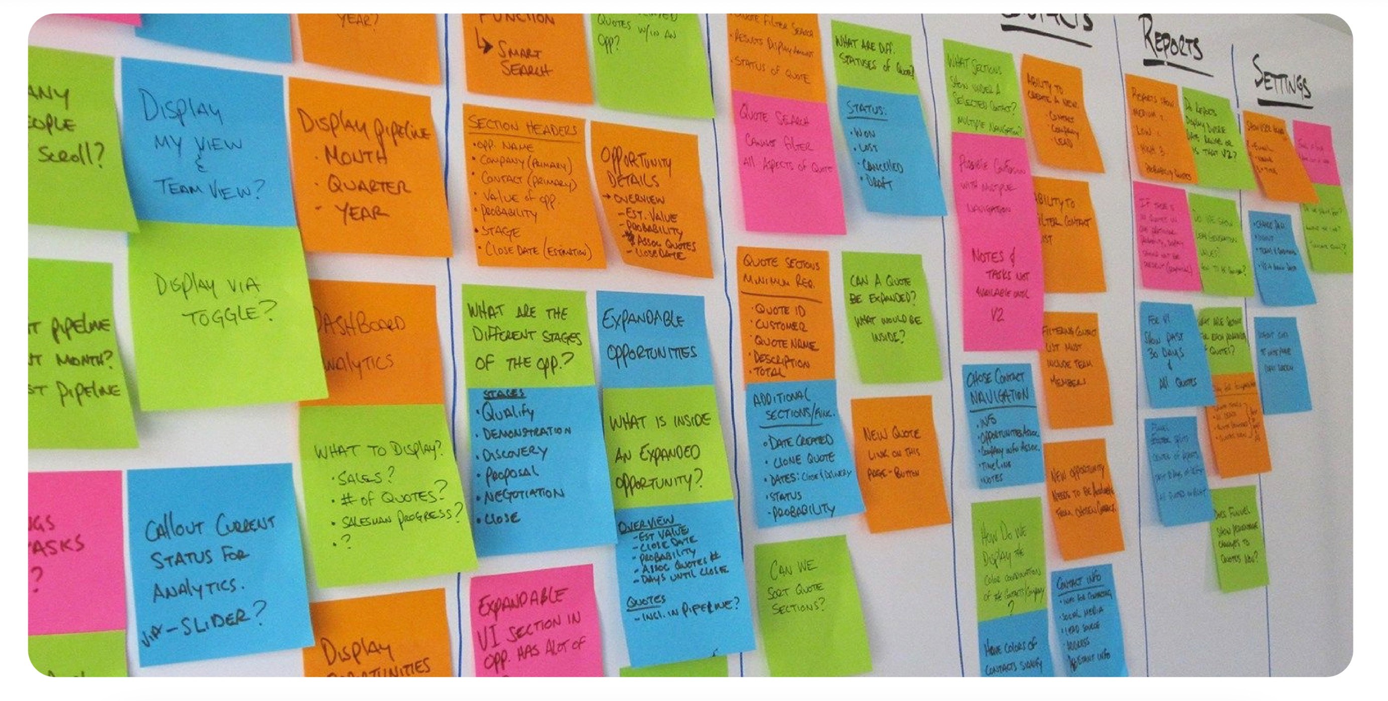

Text Frame
Before moving onto high fidelity wireframes and mocks, I wanted to get a feel for the core dashboard and navigation experience. Focusing on the distinction of multiple navigation schemes and hierarchies.
Text frames are a structural step I began implementing into web design projects in 2019 - I created it as a cost effective way of translating both early project IA and end project SEO requirements into a single working document. This has a few benefits, namely assisting in wireframe construction, acting as an end level requirements list with the familiarity of a card sort.

3. Solution
Design Decisions That Mattered
• Tertiary nav structure for deep data layers.
• Correlative metrics surface context faster.
• Progressive disclosure for advanced filters.


Data Visualisation
Creating easy-to-understand data visuals for agencies and their clients was a goal that help drive this project forward. The original version was coded without any user validation, resulting in overly complicated IA. A lot of the time, users don't know how to correctly correlate data that the system provides them back to relevant KPI's. I solved this issue by building on the familiar system of charts and graphs with the added context of correlative metrics.


Report Generation
I decided to go with a traditional top-down organisational structure due to the varied categories and desired user outcomes, although with some added considerations. This feature would ultimately be postponed to a version 1.1, none-the-less providing users with end goal actions at top level pages through the use of a nestled action menu. The menu was combined with the advanced global search menu which tested as being highly discoverable despite its apparent 'hiddenness', providing direct system wide access to frequented accounts.

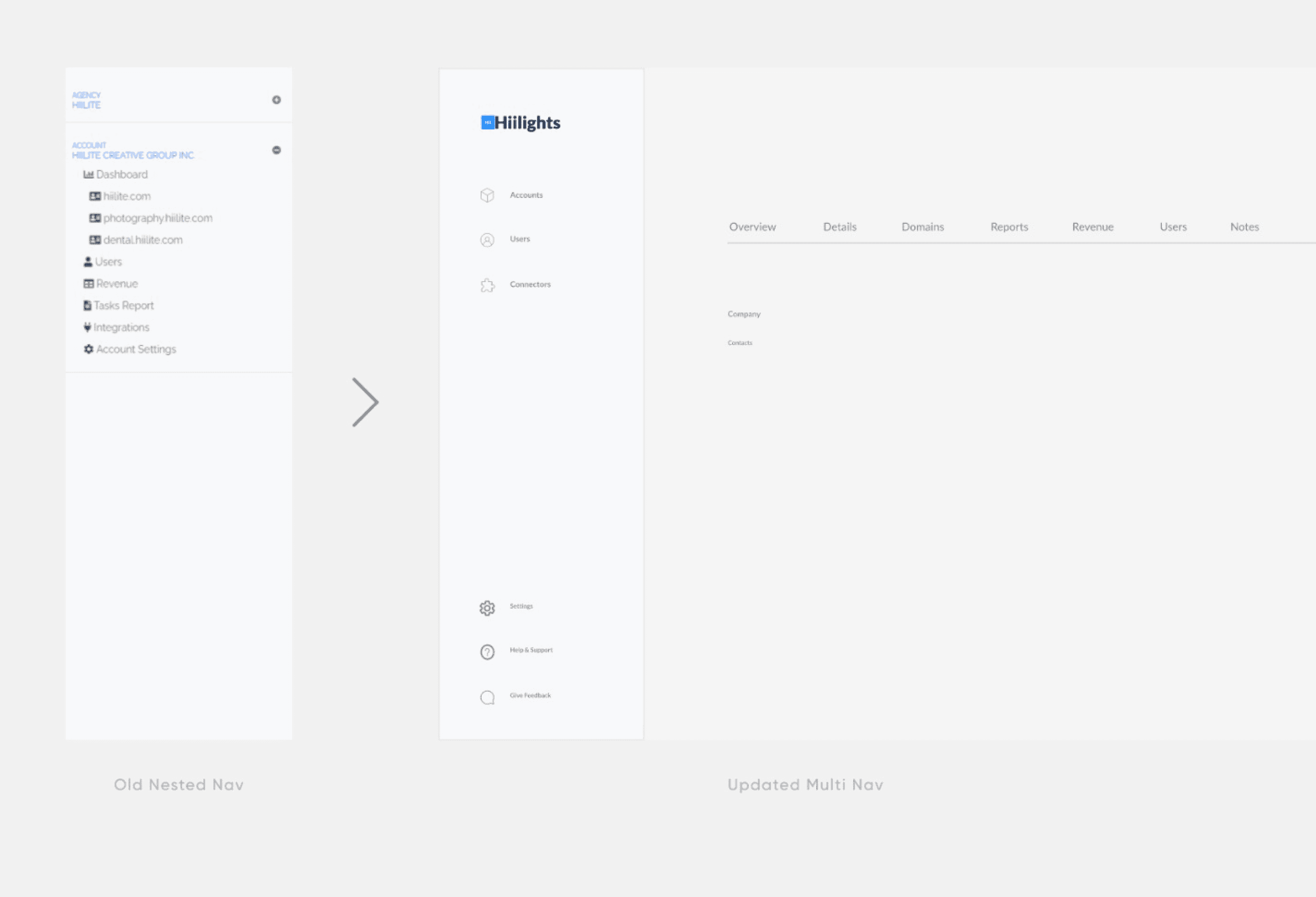
Seemless Navigation
Before establishing a familiar navigation throughout the dashboard, I had to decide what kind of navigation would work best for the user. I decided to test a sub navigation similar to the ones in CRM's, nesting all elements within nestled sections. This system reflected the original nav structure however with improved IA based around reprioritised features and validated through card sorts. While efficient at saving space, it had poor learnability due to end level pages being hidden. I created a tertiary navigation system which tested much better amongst participants. On average, completing the requested task in less than a third of the time, down from the lengthy 46 seconds.
4. Results
Outcomes & Impact
• Task completion time: ↓66%
• Usability score: ↑+25%
• 90th percentile satisfaction rating from stakeholder survey
Comparison placeholder: Responsive desktop and mobile screens side by side. Insert testimonial if available.

5. Reflection
Key Takeaways
Working on Hillights was incredibly rewarding. I got to experiment outside of standard process and had the time to explore some of the new Adobe XD features. While the project ran into some management snags, resulting in the loss of the lead developer and a pushback in timeline. I was able to execute an alpha design with v2 considerations and a fully functional prototype under budget. I'm excited to see the live build and begin the second design sprint while gaining live insights to further improve the user experience.

Explore more
Explore more


Let’s Build Tomorrow’s Products
Foster strategic collaboration to design AI-native systems that amplify human capabilities and experience