Mobile
Redesigning 925 Freelancing
Reducing Registration Drop-Off and Accelerating Job Access
Challenges
Project Vision
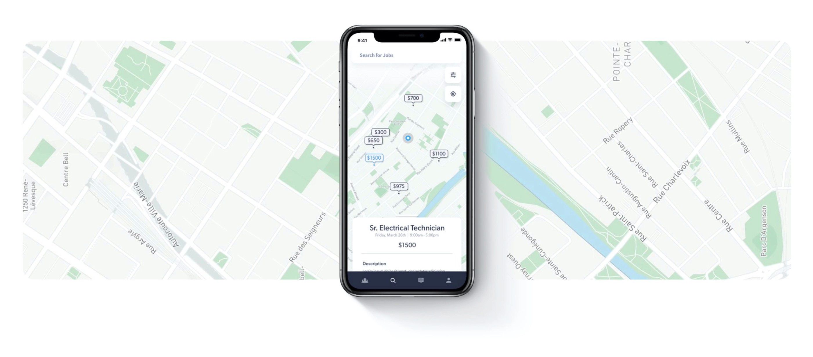
Owners and hiring managers often have a difficult time filling temporary work placements with high quality workers, commonly opting to outsource to recruitment agencies at a large premium with no guarantees. 925 (read Nine-to-Five) is a platform which blends intuitive UX aspect found in products like Uber and Google Maps into a streamlined application that connects businesses to people looking for flexible work.
1)
2)
3)
Eliminate barrier of entry on application sign-up.
Design a cohesive interface that's intuitive to both workers
and employers.
Provide a seamless and linear payment experience.

Kickoff
Preliminary Ideation
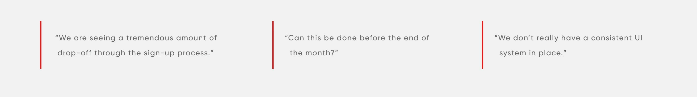
I was approached by my employer with a rather vague request,
"We have some business friends, they have a bit of a budget and would like us to rework the UX of their app, can you?" The following morning we called the client and began asking questions, a 14 minute call later and we had exactly what we needed ... "We are seeing a tremendous amount of drop-off through the sign-up process." ... "Can this be done before the end of the month." ...
"We don't really have a consistent UI system in place."
We used affinity mapping to identify the general scope of the project, primarily to help us decide which direction to pull the project. This was the summarisation of a brainstorming session that kicked off the project the would prove helpful in setting up the foundation for the rest of the process. We summarised the largest of know issues into a hypothesis statement to focus our initial test.
Project Timeline
Hypothesis
First Tests
Back to the Drawing Board
Improving the registration flow
Prototyping the wireframes
Restructuring
We allocated 30 hours across the project, after a deduction for meetings and project management, I was left with 22 hours of effective design time.
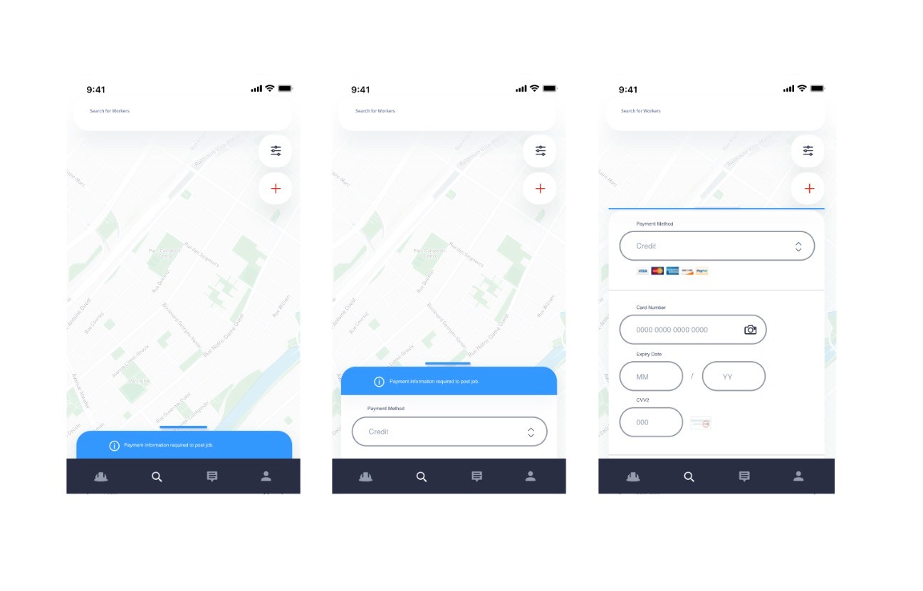
Lengthy, unoptimised (for mobile) background check is causing too much friction during registration process, resulting in user drop-off before completion.
Out hypothesis was that the entry point (Background Check) into the app was too difficult to be an effective means of worker validation prior to a user evaluating the system. I initially experimented within the confines of the old Ul by removing the Background Check altogether. To our surprise, this didn't improve the amount of registrations being completed! So what was going on? When we dug in, we found that many people simply didn't have an good enough understanding of the applications offerings prior to registration, there wasn't enough indication of offerings or a clear enough value proposition to merit a lengthy registration process.
So I went back to the drawing board with a new question in mind, what is the minimum changes needed to eliminate the barriers of entry into the platform? Fortunately the client was able to provide an InVision prototype of the existing application, this allowed me to conduct rapid user testing. I removed all forms, replacing them with confirmations where needed to support the flow. This worked! Completion of all features increased across the board with job registrations being submitted as much as 80% more than before! One issue remained, the Ul still felt dated, but I had the ammunition I needed to push for a reworked IA where the Ul was planned to be addressed in our next phase.
We didn't stop there. During this initial testing phase we wanted to make the registration process virtually non existent, at least in the convention sense. The driving ideal being a reduction of screen and steps into as little steps as possible - where 1 action was the gold standard. It wouldn't be easy, but it would result in as frictionless an experience as possible, so long as it remained intuitive to use.
Our previous registration process had 4 in app steps, requiring 12 user actions, not including the addition 40+ for the background check. In testing we effectively relocated the steps as part of end goal actions. This would reduce friction on registration, and open the app for discovery.
Building on the organic structure defined by text framing, putting together wireframes is simply a matter of blocking content, defining a reliable navigation system, and working with components for rapid iteration. After blocking text into components I
linked together the art boards using Adobe XDs prototype feature and began validating the flows through some rudimentary testing. After making additions and removing redundancies based on feedback, all I had to do was update the components and the Ul would fall into place. Typically these stages happen sequentially where a tight timeline can sometime demand a process that favours quicker iterations and rapid testing.
Good information architecture creates clear paths for visitors, makes a site easier to navigate, and enhances the user experience. In term of a general redesign, the hardest part is explaining what aspects are more important than others. During this project we wanted to root the Ul around the idea of a location based search, determining that a map would be a suitable vl. I began reworking the architecture in XD through a technique I call Text Frames. Writing a list of all functions features and screens in plain text, then reorganising into separate art boards. This method helps sort quicker than paper or a white board because of the nature of moving and duplicating text. This is pre-visual, iterative and messy, where the focus is simply the organisation and defining of required information.
FIRST INSTINCT
Relocate Background Check From Registration to Profile
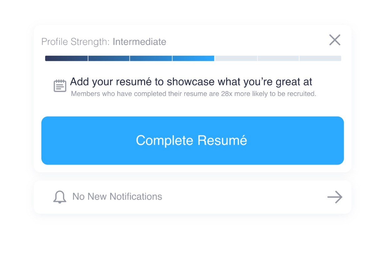
Progress (ie. % likely to be hired for role if completed)
TAKE TWO
Before & after using old Ul to test:
WHY?
Here’s what users saw:


SECONDARY
Name: John
Age: 36
Occupation: General Worker
John is a jack of all trades, he's primarily worked construction throughout his life, having driven and operated machinery for a number of years in-between. With these added certifications, John will get offers when new projects open up in the area, but finds it difficult to accept smaller term jobs due to the uncertainly of work once completed, despite being more lucrative than the longer term contracts.
John is looking for a way to maximise his working time on high paying sites while having the guarantee of work afterwards.
Defining the users
PRIMARY
Name: Adam
Age: 31
Occupation: Building Contractor - Business Owner
Adam is a building contractor who bids on construction projects and fills a team to meed the demands of the contract. These jobs often seasonal and are varied in length. Adam often hires familiar faces because of the trust that's built over time, he's been burned in the past with new hires from online job platforms and is reluctant to hire strangers but ultimately fills positions where needed. Most of his connections are referral based. Adam doesn't care for "paperwork" as much as having reliable people who work hard.
Adam splits his time, opting to work on site as much as he does managing his crew, he's often time bound, woking on tight deadlines. He would like to grow his worker pool but lacks the time to market his business.
Creating good products is a combination of understanding both the user and the business. In the instance of 925 we determined that the Employer represented the consumer, where the workers represented the inventory. Not my favourite analogy but it certainly goes along way in understanding the product dynamic. Increase active workers on platform, have more supply to meet the demand of employers seeking to fill positions.


Multi-User System
Creating an interface that accommodates two wildly different user types often becomes a game of trade-offs and compromises, the easiest way to overcome this hurdle was to break apart the system into two categories; for those looking to hire, and for those looking to work.
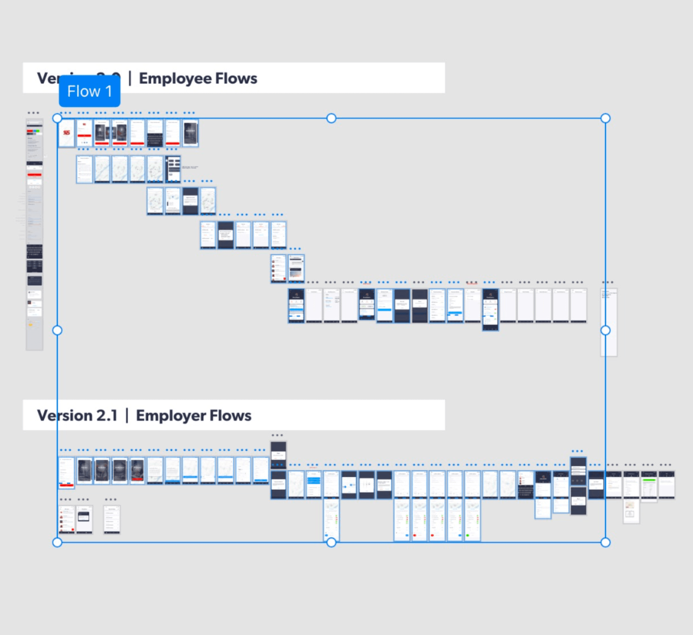
In the image of the wireframes earlier, you'll notice the primary flow section, separated into two categories. Separating and designing these in flows in isolation of each other allowed me to make non-compromising decision for that user type. This allowed us to effectively create a multi-user system that didn't overburden the user with information, sections, and features they ultimately wouldn't need to use.
CHALLENGE 2

Explore more


Let’s Build Tomorrow’s Products
Foster strategic collaboration to design AI-native systems that amplify human capabilities and experience